Letting the energy flow: Jimmy Turrell
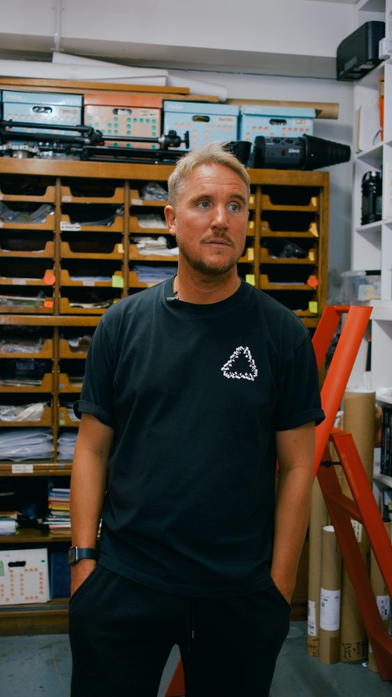
Very few manage to blend traditional and digital art techniques quite like Jimmy Turrell. A graphic artist and video director, his work is a vibrant collision of past and present, his vision stemming from the inserts of a geography textbook to the music of AC/DC. Here, Kate Hewison meets Jimmy to discuss his extraordinary career, what his art means to him and his new exhibition at The Baltic, in Gateshead.
July 16, 2024
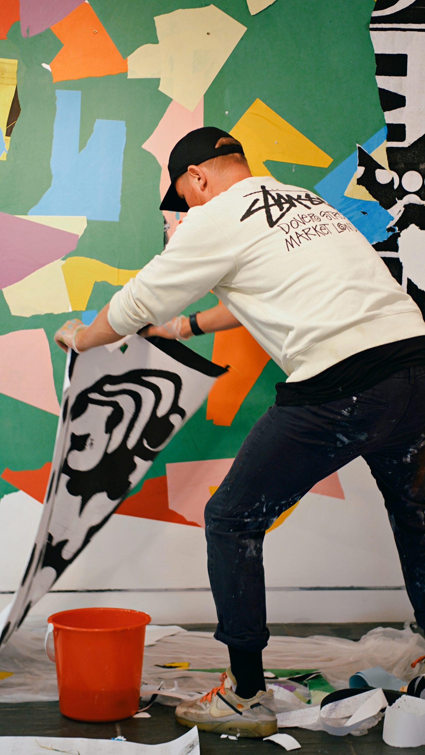
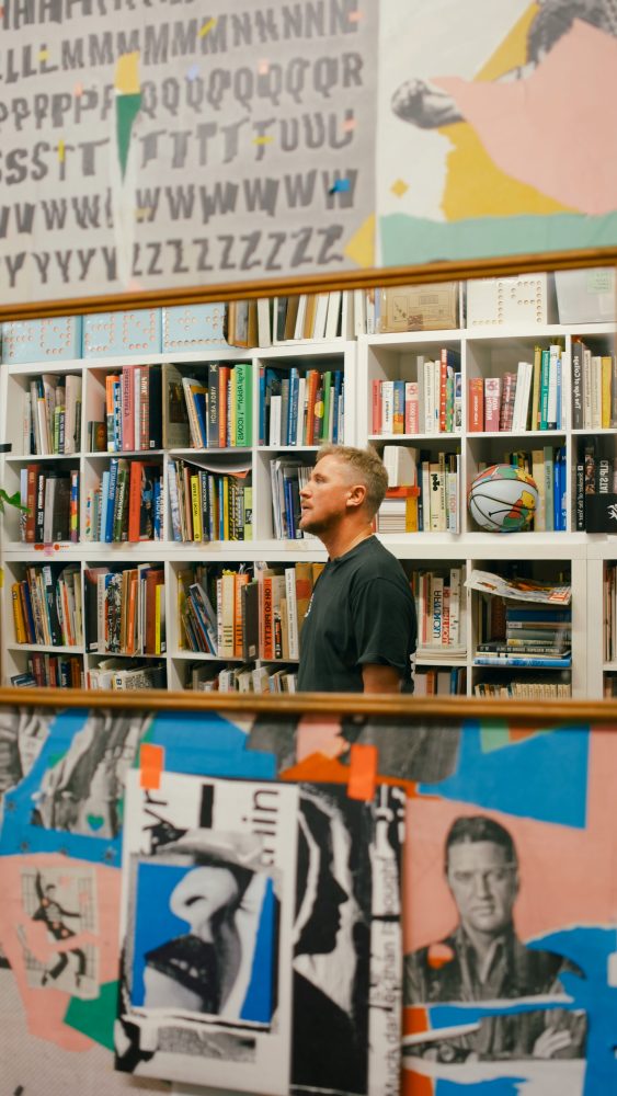
We walk into Jimmy Turrell’s Ouseburn studio.
There are boxes of magazine clippings and props piled high, song lyrics on the wall and enough design books to start a library.
It’s like stepping into Jimmy’s brain, witnessing how he draws inspiration and his ability to find the beauty and potential in almost anything.
“If I spill something, I don’t mind, it feels like part of the process,” he says.
Very few manage to blend traditional and digital art techniques quite like Jimmy Turrell.
A graphic artist and video director, his work is a vibrant collision of past and present, his vision stemming from the inserts of a geography textbook to the music of AC/DC.
Even after training at the respected Central Saint Martins and collaborating with some of the world’s most renowned names, Jimmy remains a true Geordie boy at heart, with his notable primary colour palette taking inspiration from the Byker Wall estate.
There’s no one-size-fits-all approach when it comes to his execution, his innovation comes more from the idea of ‘structured chaos’.
Here, Kate Hewison meets Jimmy to discuss his extraordinary career, what his art means to him and his new exhibition at The Baltic, in Gateshead.
Who or what inspired you to pursue a career in art? As a youngster, was it always a path you were keen to follow?
My inspiration was shaped by my early environment and the influential figures in my life.
Although neither of my parents were traditionally creative, they were very supportive of the arts, and encouraged me to explore my artistic inclinations from a young age.
My dad, a firefighter and carpet fitter, would bring home large rolls of paper left over from carpet installations.
I would sit on these rolls and create huge narrative drawings until I filled up the entire space; that was my first introduction to drawing, painting and mark making.
My parents also loved the works of Charles Rennie Mackintosh, William Morris, Art Nouveau and Art Deco.
We frequently visited the Glasgow School of Art and The Hill House, which greatly influenced my appreciation for art.
The idea of turning this passion into a career was sparked by a book I found in my GCSE art class: The Album Cover Album, by Roger Dean.
This compendium of the best album cover designs introduced me to the works of Hipgnosis, Barney Bubbles, Vaughan Oliver, Peter Saville and other amazing designers.
From that moment, I knew I wanted to design for music.
I also owe a lot to Val Fitzgerald, my art teacher at the time, for introducing me to this book, and for being an amazing teacher in general.
These influences made me realise art wasn’t just about creating beautiful images but also about communicating ideas and emotions in a unique and powerful way.
What initially drew you to graphic art and video direction?
I was drawn by the sheer power of visual communication and the endless possibilities it offered for creative expression.
The way visuals could convey a message or evoke a feeling without a single word fascinated me.
Graphic art, with its mix of typography, imagery and colour, felt like a natural extension of my love for drawing and collage.
Video direction happened by accident.
The first video I worked on was for Beck’s single ‘Wow’.
Although I had never directed before, I decided to fake it until I made it.
It is a blend of spontaneity and structured experimentation.
It starts with a simple idea, which can come from anywhere – music, street art, a vintage magazine, a paving stone or a fleeting moment in everyday life.
“Inspiration is everywhere, and I make sure to keep my eyes and mind open to it.”
Once an idea sparks, I begin with exploration and research.
I collect visual references, sketch rough concepts and experiment with different styles and techniques.
This is a crucial phase, where I allow myself to be messy and free, letting the creative energy flow without overthinking it.
Next, I refine my sketches, experiment with compositions, and work out colour schemes.
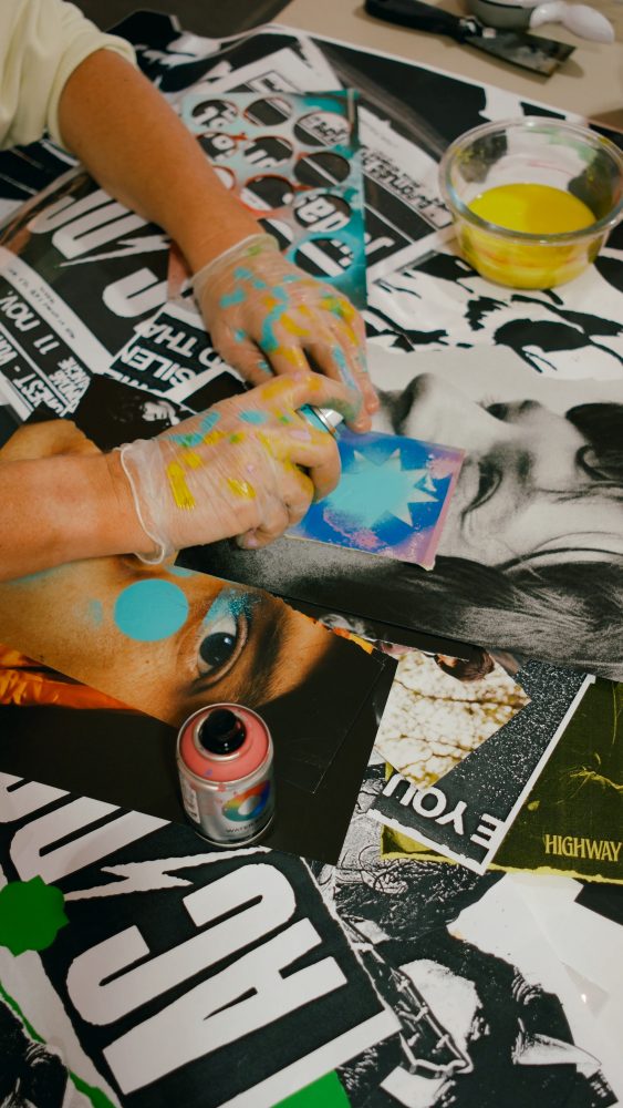
Collage is a huge part of my process; I love combining disparate elements to create something new and unexpected.
For video direction, this process extends into motion and narrative.
I work on storyboard scenes, plan visual sequences and collaborate with animators to bring the vision to life.
It’s about finding the perfect synergy between visuals and sound to tell a compelling story.
“Throughout the process, I remain open to experimentation and happy accidents. Sometimes, the best ideas come from unexpected mistakes or last-minute changes.”
It’s all about staying flexible and letting the creative journey unfold naturally.
By the end, what started as a simple spark of inspiration transforms into a fully realised piece of art.
Are there any challenges you face when blending traditional and digital art forms? If so, how do you overcome them?
Blending traditional and digital art forms does come with its challenges, but these challenges make the process exciting and rewarding.
Traditional art has a tactile, organic quality that can be hard to replicate digitally, while digital art offers precision and versatility that traditional methods might lack.
To overcome these challenges, I embrace the strengths of each medium.
I use traditional techniques like drawing, painting and collage to create the foundational elements of my work.
The digital part is usually subtle, involving slight tweaks to compositions and textures.
Another challenge is maintaining a cohesive aesthetic throughout the piece.
It’s easy for the traditional and digital elements to feel disjointed if not handled carefully.
To address this, I focus on colour harmony, consistent textures and a unified visual style.
I often scan my handmade work at high resolutions to capture every detail and nuance, ensuring the digital enhancements complement, rather than overpower, the original artwork.
How does your North East heritage influence your art?
Growing up in Newcastle, I was surrounded by a rich tapestry of history, culture and industrial landscapes.
My early years in the Byker Wall estate, with its vibrant primary colours and dynamic geometric architectural shapes, left a lasting mark on my aesthetic.
“There’s also a certain raw, unpolished charm to the North East that seeps into my work, whether consciously or subconsciously.”
The sense of community and strong work ethic characteristic of the area have also shaped my approach to art.
The people here are resilient and resourceful – qualities I try to reflect in my creative process.
This hands-on, DIY ethos is a source of pride and a constant reminder of where I come from, grounding my work in a sense of place and identity.
Are there any particular pieces of music or events that have had a significant impact on your art?
I particularly love what Warhol did for The Stones and The Velvet Underground in the late 1960s.
The cover of Sticky Fingers, with the actual zipper that revealed white underwear with the Rolling Stones’ tongue logo, was a revelation.
It showed me how powerful the combination of sound and visuals could be.
Directing the ‘Sweet Sound of Heaven’ video – featuring Lady Gaga and Stevie Wonder – for The Rolling Stones last year was a dream come true, and felt like a full-circle moment.
I also admire what Barney Bubbles did for Ian Dury and Elvis Costello, especially his artwork for Armed Forces.
The album cover is littered with references to both politics and love, using them as metaphors for each other.
His mix of styles and techniques, and the diversity of subject matter, ranging from figurative to pop and abstract, is quite startling.
Events also play a crucial role in shaping my art.
Attending Glastonbury Festival for the first time was a sensory overload of music, art and culture.
The energy and creativity on display were mind-blowing, and motivated me to explore more dynamic and immersive forms of art, including video direction and live visuals.
I was later commissioned by The Guardian to illustrate their promotional material for Glastonbury.
The campaign, entitled ‘Flyposter My Life’, was based on the concept of a person fly-postering all their music memories.
In terms of a feel and colour palette, they wanted the campaign to be ‘super pop’.
I also designed the interior and exterior of The Guardian Lounge, which included an exhibition of original framed artworks, fly-postering all the stage panels and creating large 3D letters above the stage.
My design assistant was Marcos Villalba.
You partner with a lot of well-known international brands. Are there any campaigns in your portfolio that especially stand out as memorable pieces of work?
Some of my most memorable projects have been within the fashion world.
Last year, I was commissioned to art direct the after-show visuals for Chanel’s Métiers d’Art show, in Manchester, set in the beautiful empty pool of Victoria Baths.
I’ve also worked on campaigns for Adidas and Uniqlo.
Earlier in my career, I worked on the store magazine for the famous Parisian concept store and gallery Colette, located near the Louvre.
In the music world, I’ve collaborated extensively with Beck, designing his last two album covers, several lyric videos, tour graphics and stage animations.
I’ve also created music videos for Elvis and The Chemical Brothers and worked for artists and labels ranging from Aretha Franklin, The Rolling Stones, Pharrell Williams, The Prodigy, Wu-Tang Clan, David Holmes, XL Recordings and Heavenly Records.
Recently, I art-directed Kasabian’s new album Happenings, with help from fellow North East artist Josh Aitken. That was a total blast!
I’ve also worked on numerous charity projects for Teenage Cancer Trust, War Child, Red Cross, and the Elton John AIDS Foundation.
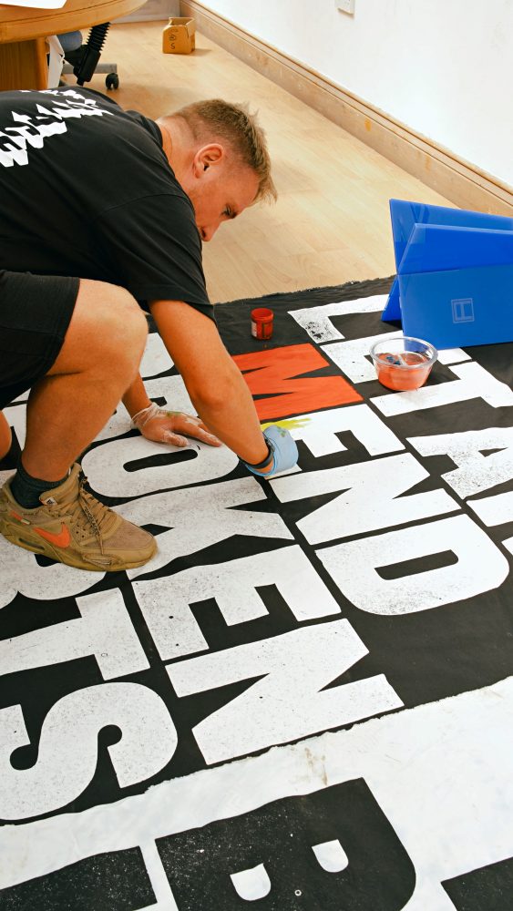
Tell us about your current exhibition at the Baltic
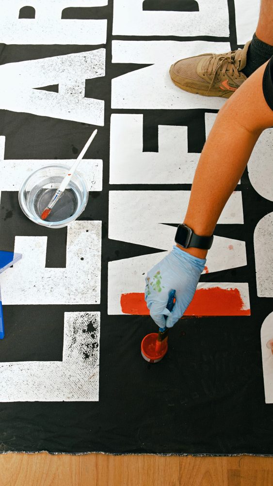
My new pop-up show, titled Shifting Surfaces: Parts I, II, & III, brings together a series of works that will transform and reconfigure over six months in three separate stages, using techniques like hand collage, overprinting and painting.
The work ranges in subject matter from collages of some of my musical heroes to a combination of language, slogans and found material.
I aim to create an organic shift in perspective in each of the three stages, juxtaposing type and image to reconstruct the meaning of each piece.
The wholesale redaction and occasional destruction of some of these pieces is necessary for the next stage to exist.
I’m currently installing Stage 2, which has a more political edge and uses larger-scale paste-ups.
It addresses issues such as the current conflict in the Middle East, the decline of the Conservative Party, the rise of right-wing authoritarian governments in Europe and the US, and the impact of the overturning of Roe v Wade in the southern states of the US.
These themes emerged after lengthy discussions with female friends and family members.
July 16, 2024
- Feature